

StockDotGenie (SDG) provides to new, novice and experienced traders, a Graphical User Interface that could have been the basis for a modern video game. This was intentional to provide clear and unambiguous signals that are always easy to understand and act upon. The primary goal of SDG is to distill complex Technical Analysis concepts into quickly recognizable, easy to understand icons and flags. Each of these icons is indicating an important change or status in this stocks technical picture with the computer, not you, doing the analysis. Think of it as a Technical Analysis Autopilot. The pilot is still required to be in control, but the autopilot is handling all of the background calculations freeing the pilot to concentrate on what is going on outside of the window or what we like to call situational awareness. You can and should selectively reduce myriad signals down to the core indicators that complement your trading style.


StockDotGenie (SDG) provides to new, novice and experienced traders, a Graphical User Interface that could have been the basis for a modern video game. This was intentional to provide clear and unambiguous signals that are always easy to understand and act upon. The primary goal of SDG is to distill complex Technical Analysis concepts into quickly recognizable, easy to understand icons and flags. Each of these icons is indicating an important change or status in this stocks technical picture with the computer, not you, doing the analysis. Think of it as a Technical Analysis Autopilot. The pilot is still required to be in control, but the autopilot is handling all of the background calculations freeing the pilot to concentrate on what is going on outside of the window or what we like to call situational awareness. The two links below provide a quick overview of each icon and the signal it is producing. Links at the bottom of both of these pages will return you to this location. New to Technical Analysis, visit our page: "Value of Technical Analysis."

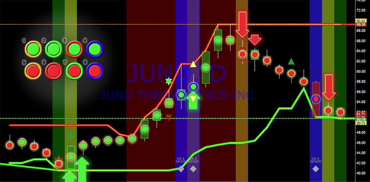
StockDotGenei's indicators can be stacked, arranged, hidden or combined within the frames of the TradingView platform in any way you desire. Above is the setup that I prefer. In the top frame is the primary SDG indicator and a complete explanation is provided below and on additional pages of each of the uniques indicators provided by SDG. To see the underlaying candles just mouse over any SDG Dot and all of your candles will appear. The primary intent was to produce a platform that alerted the user to any important change in the trading environment of any stock you may be watching. On this page and the following pages, are a great deal of instructional and educational materials we hope you will find helpful. All of these pages are easily accessible through the main dropdown menus (HOW IT WORKS, TECHNICAL & TRADING GUIDE and SUPPORT & BLOGS) at the top of each page.
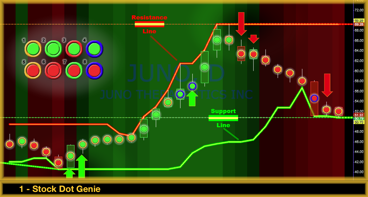
StockDotGenie (SDG) enables new and novice traders to jumpstart their trading expertise by utilizing a simple to use Technical Analysis system. SDG distills that information into a single DOT allowing you to quickly and easily determine, through simple visual cues, what your stock's short term price trend is likely to be. Because SDG was designed as a swing trading tool, it excels at determining and flagging turning points as prices approache support or resistance. These are the areas where stocks make dramatic advancements or change directions. This makes SDG a valuable trading tool for every trader, in every timeframe.
Every indicator that contributes to the generation of the Genie's Dot colors are described below. Some like the Master Moving Average Envelope are themselves the product of multiple, independently calculated indicators, with only the cumulative, distilled output presented to the trader. Independently, each can provide valuable insight into what an equity's price is most likely to do next. The one thing to keep in mind though, is each of the indicators described below, contributes in some small or large manor, depending on the situation, to the final color of the Genie's Dot.
The SDG site provides more than 25 pages aimed at providing new and novice traders with a global pictures of some of the most valuable lessons all successful traders have learned and automatically incorporate into their trading protocols.
If your prefer to jump into detailed explanations of the technical analysis that powers these unique trading tools, please go directly to the first SDG Instruction page. The Genie's lamp (our logo) at the bottom of each page is also a direct link to the SDG Trading View Application package.
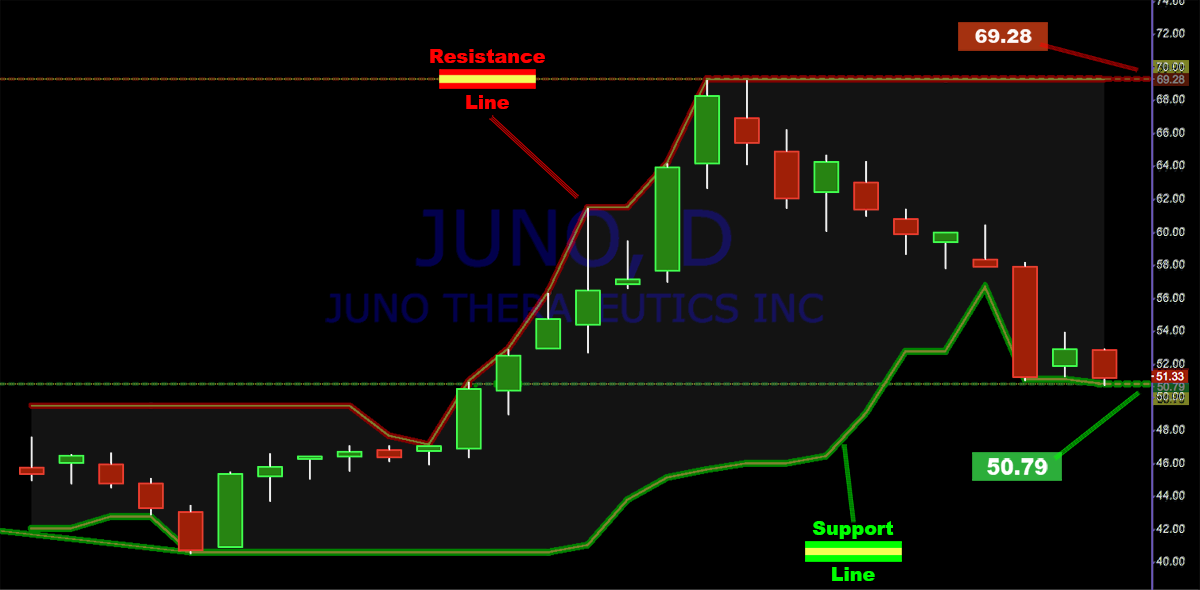
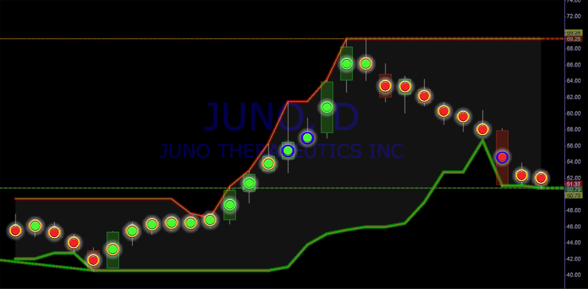
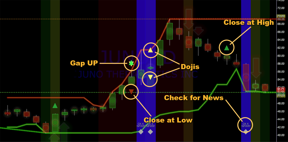
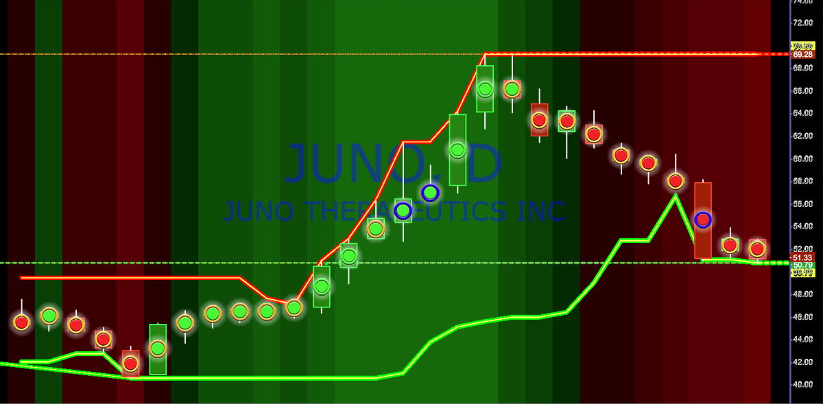

The DOT in Stock Dot Genie is a simple and intuitive indicator. In its simplest form, SDG’s signals are presented to you as green or red dots painted on top of the price action candles. You can always view the underlying candles by simply mousing over the dots. Two distinct calculations are utilized to produce these dots. The Primary Dot Calculation (PDC) is triggered when the stock has touched support or resistance and moved away from these important levels. The PDC is then utilized for the next three consecutive (3) trading bars. The PDC's color is derived by calculating and comparing the center-weighted position of each candle's real body and determining what this relationship is to the previous candle. This includes a very short term, weighted, center-of-gravity calculation. If todays weighted dot calculation has a higher value than the calculation of the prior dot's weighted data, the current dot is painted green. If it has a smaller value, it is painted red. Because we are attempting to extract both sentiment and momentum from the candles we are using the entire candles body for comparison, not just the price. Green indicates buy or remain in a trade. Red indicates sell or remain short in a trade. The indicator is simple, but is utilized only as a turning point bridge at the point in the cycle where moving averages are the least accurate. A complete explanation of the DOTs can be found on this page.
If you are trading an uptrend in a stock, you enter and stay in as long as the dots remain green. If they turn red, you may want to sell your position or short the stock. There is a relatively simple rule we utilize in these situations. One red dot, hold your ground. Two red dots, don't stick around. Unfortunately all situations are different and situational awareness of the stock you are trading is critical to being successful. Situational awareness is discussed on the "Links," page.


Closing Score calculates the range of the day, sometimes referred to as the “True Range,” by dividing it into 100 equal segments. You can then determine the stock's Closing Score by determining where on this range of, 0 – 100, the closing occurred. This is as close as you will get to the market directly signaling, from a single indicator, what the sentiment or emotions of the traders in this equities are. “Be fearful when others are greedy and greedy when others are fearful,” is an often quoted statement by Warren Buffet. He would equate a score of 100 as demonstrating extreme greed. A score of zero would be extreme fear and any score around 50 as demonstrating ambivalence. The Closing Score is plotted as gray, green or red dots, plotted on a scale of 0-100. A complete explanation of Closing Score can be found on this page.


Closing Score and Long Tails Count, counts a 10-day, cumulative look at both the occurrences of strong or weak closing scores as well as the occurrences of long tails. Here again, you have additional tools that provide you with indications of sentiment, but also how sentiment is transitioning over time. The blue columns indicate trading days that produced long tails and again provides you with a ten day running total. Because most institutional and all program trades are designed to be executed with a specific price range, often referred to as bracketed trades, when retail traders' orders are all completely filled outside of these parameters the only orders remaining to fuel the market are orders who's prices are bracketed and thus the trading range will revert back into this channel producing a long tail in those trading days. Of course, there are other circumstances that can cause long tails, but when you see a series of days that all have long tails and the price trend is not changing dramatically combined with approximately equal trading volume for those days, you are in all probability seeing institutional and / or programed trades. You want to see this indicator climbing and reaching above 8 before it is meaningful in my experience, but watching the long tails indicator tick up can be important information. You are allowed to adjust how close those parameters must be in order to be counted. The Closing score default is 10 for the low and 90 for the high. The default for the long tail is 0.85. A complete explanation of Closing Score and Long Tail Counts can be found on this page.

The Candle Body Size is a good indicator of trend strength. Long candles support strong trends. When the candles get small, as the enthusiasm evaporates and momentum decelerates, you are entering a territory where turning points occur. The complete explanation for Candle Body Size can be found on this page.


Volume is easily the second most important point of information you will receive each day, second only to price. We utilize it to confirm all of the other indicators. If the volume is higher when a signal is produced, we view that as a conformation of the signal. The DOT's superimposed on the volume bars are simply indicating if today volume is greater than yesterdays. Green is true, red if false. The blue background behind the volume bars indicates the 14-day moving average of the daily volume. The Blue line above the bars is the 14-day Center of Gravity calculation for volume. As with all other SDG indicators when volume spikes above the COG of the average volume for the prior 28 days a blue or white background flag is produced. A complete explanation for Turning Point Volume can be found on this page.

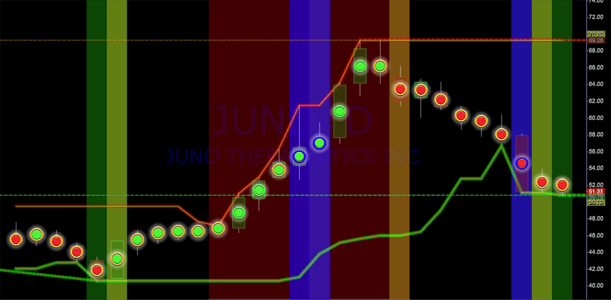
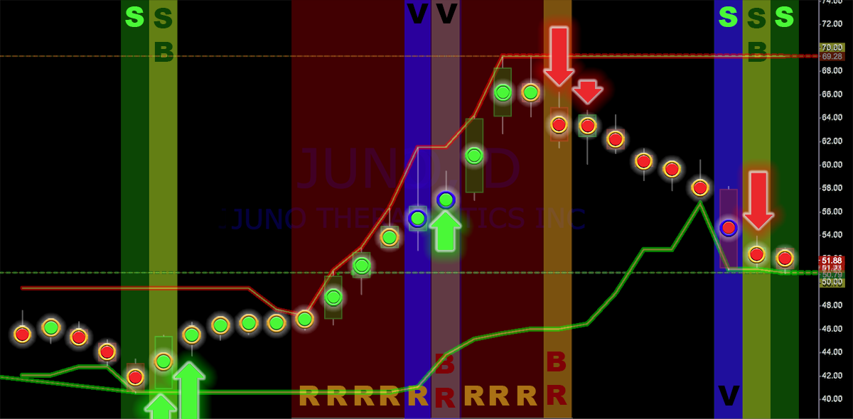
SDG also provides you with a secondary system, based on multiple technical calculations, including closing score, relative volume, relative candle size, center of gravity and trader sentiment, all of which are combined to assist you in making the most profitable decision as to when, or even if, you should enter or exit a trade. These indicators are provided as an outer ring to the primary, center dot calculation and color. Candlestick analysis is a complex process that has been distilled into this simple analytical process. A complete explanation of the technical analysis that fuels the rings can be found on the first instruction page, as well as on the icon flag page.

Step by step signals are generated by SDG to alert and guide you when your stock has neared or touched support or resistance. These are indicated by a change in the color of the background. A complete explanation of the technical analysis that generates the Background Flags can be found within the instruction page as well as on the background flags page.
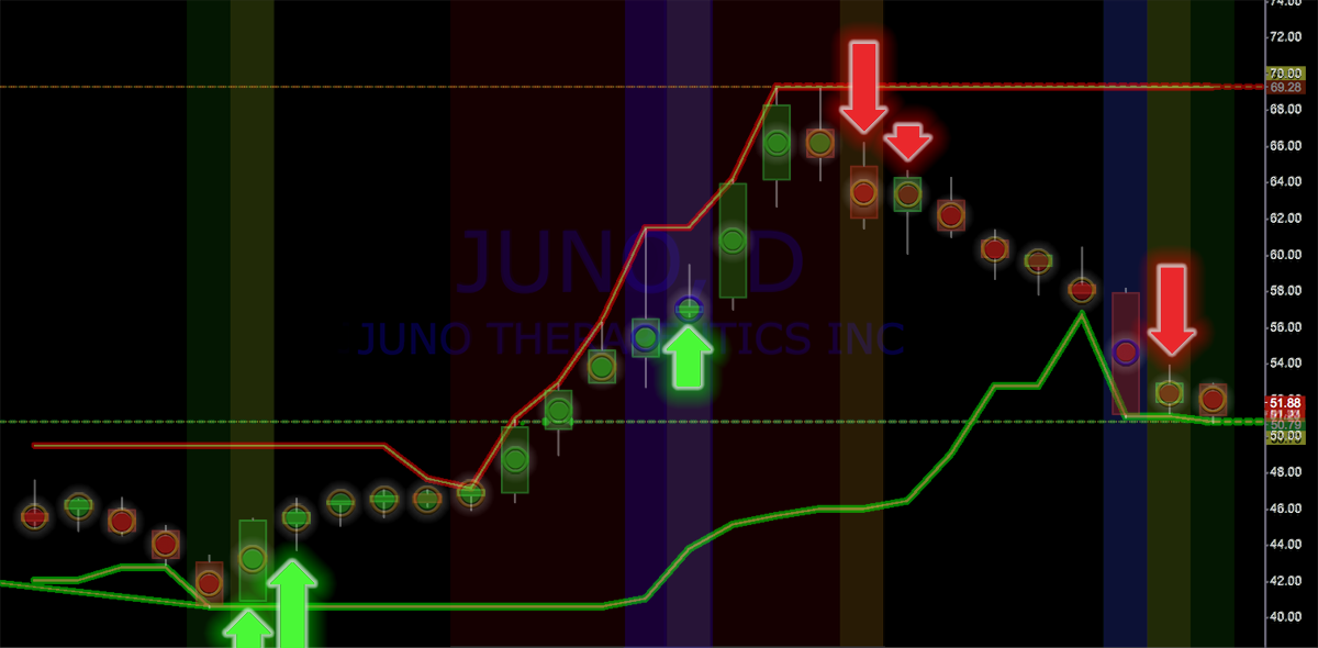
Conformation / Contradiction arrows indicate both a change in price direction or a Turning Point, as well as possible entry points. A complete explanation of the technical analysis that generates these important signals can be found within the instruction page, as well as on the background flags page.
Tradingview is an amazingly versatile platform that allows you to rearrange, delete or add any of the other custom indicators that either come standard on the site or are produced by a very talented programming community. Many excellent indicators produced by these programmers are provided free of any cost. Many of these exactly replicate professional platforms that cost their users many thousands of dollars. Some require a nominal monthly fee like SDG. You get to pick and chose and then produce you own ultimate trading platform with little or no additional expense to your own bottom line trading cost.

[1] The TAO of Trading: Discovering a Simpler Path to Success by Robert Koppel 1998 Dearborn Financial Publishing, Inc. Amazon link here